Hi, I'm Hayden Quilty.
I'm a data scientist at Integrated Specialty Coverages. I build AI-powered insurance services. I have deployed multiple machine learning models end to end, doing everything from business problem understanding to training a model and integrating predictions into the platform.
This website shows off some of my hobby projects across my different interests. This website was built with GitHub Page and Hugo using the Ananke theme with some custom CSS and JavaScript.
My resume is available here. You can reach me at jhquilty99gmail.com. My LinkedIn is here. Scroll down for my portfolio of projects.
Machine learning experiments and data visualizations, designed and built by Hayden Quilty
March 23, 2023
Climate Visualizer Website
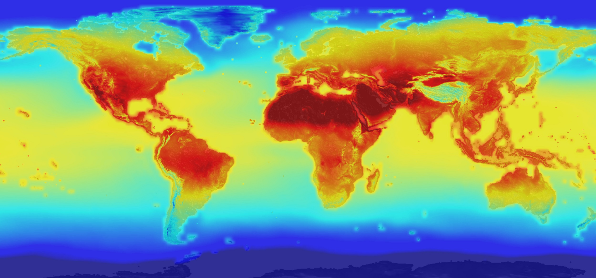
I created a website to analyze climate metrics over time. This is Plotly Dash application that displays climate data over the past 60 years anywhere in the world. I was inspired to create this project as mean global temperatures have increased nearly 2 degrees Fahrenheit in recent history, but it was hard to connect that to the changes in my local climate. The application highlights the change in mean temperature, snowfall, and days of frost year by year, which allows you to see the climate change in your area.
read moreMarch 7, 2023
Inflation Exploratory Data Analysis
While going through a period of high inflation in 2022 I started to wonder if there were trends in the inflation of certain good by regions. This could prove useful when looking looking to make major purchases for items like homes and automobiles. I created a script that would allow a user to explore different ways of visualizing the inflationary data of housing, renting a house, and the overall CPI by region.
read moreJuly 6, 2021
Northern Virginia Monthly Conditions
It was getting late in the winter, spring was just around the corner, but I wasn’t sure if now was the right time to sow some seeds for the garden. I looked for resources online for when to sow different seeds and the Farmer’s Almanac has a plant date for every seed and region imaginable. This let me know that a good time to sow most seeds, ie last frost date, was late April in Northern Virginia.
read moreApril 6, 2021
Portfolio Risk Mix Visualizer
Let’s say you have $1,000 and you’d like to invest in the stock market but you’d like to balance the risk and rewards between stocks and bonds in your portfolio. This Tableau visualization will allow you to evaluate the potential return on investment with a variable ratio of stock to bonds. The visualization shows the growth of your $1,000 in the 2008 recession or over the past two years (2018-2020) which is characterized as a growth period.
read moreDecember 10, 2020
Urban Sound Classifier
Urban soundscapes are hectic places where the sounds of people and machinery are always a commotion. In order to make sense of the busy noises of a city, we developed a data science algorithm to classify these sounds. The classifier is able to distinguish between 10 different urban sounds. I did this project as part of a collaborative masters project at Virginia Tech with Brannon King.
We digested the 10,000+ sound files with the librosa python package and extracted features such as RMS Frequency, Amplitude, and Length.
read moreOctober 8, 2020
Spotify Playlist Clustering Techniques
Like so many other Spotify users I find myself dumping all of my favorite songs into one massive playlist. If only there were some way to automatically make cohesive playlists out of the 1000+ songs I like to hear on Spotify. Thats how I turned to data science to inform and automate my playlist creation.
In this project, I examined the different dimensions that were offered by Spotify’s API. At first I did some Exploratory Data Analysis (EDA) and made functions that would taken a given Spotify playlist and generate histograms of songs by decade and amplitude, as well as bar charts for breakdowns by artist and album.
read moreFebruary 13, 2020
Cover Art for ACS Letters of Medicinal Chemistry
While working in a computational biology lab, I was interested in learning more about how to visualize the unseen. This brought me down the rabbit hole of Biomolecular Visualization or using 2D graphics and 3D representations to better understand the structure of proteins, carbohydrates, and other biomolecules. I created a mini research paper to highlight my findings here.
I then taught myself how to utilize pymol structures in Blender and render them with realistic lighting.
read moreApril 6, 2018
Weather Balloon Visualization
As part of an engineering project in high school, we created a weather balloon and sent it 20 miles into the sky with GPS and thermometers to record temperature and position over time. Once this project was completed, and we had all this data which tracked millions of seconds over the 2 hour journey of the balloon, it was now a question of what to do with it. At first I though it would be good to visualize the data using simple 2D graphs but then I realized that could be missing the full view.
read moreFebruary 1, 2018
DNA Transcription Animation
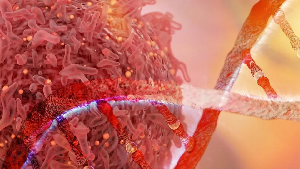
I wanted to use my skills with Blender to try and piece together the puzzle of what is happening with DNA transcription. I used what I already knew about DNA transcription from my textbook in addition to other graphics I had found on the internet to come up with a storyboard for the animation. Then I looked at online resources for downloading biomolecules and came across https://www.rcsb.org/ which had resources for every biomolecule I needed.
read more


